
Creating Effective Charts and Graphs in Excel: A Comprehensive Guide

Charts and graphs are excellent visual tools for presenting information and ideas. Even though spreadsheets are crucial for handling data, they are frequently cumbersome and fail to convey the patterns and linkages in the data to users. Excel can help by transforming your spreadsheet data into charts and graphs so that you can generate a clear picture of your data and make knowledgeable business decisions.
Microsoft Excel offers a variety of tools and options for creating charts that are both aesthetically beautiful and instructive. In this comprehensive guide, we’ll look at the step-by-step process for creating effective charts and graphs in Excel, along with best practices to ensure you understand the function of every graph and chart.
Best Data Analytics and Gen AI Course - Enroll Now!
Different Charts and Graphs in Excel
Complex data analysis is easier to understand when the data is represented graphically using charts. There are different types of charts and graphs in Excel, each of which offers unique features and methods of depiction.
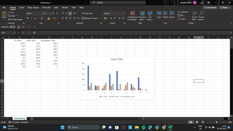
Column
Column charts in Excel, one of the most popular presenting charts, are used to compare values. This typically refers to values that have been in some way categorized. One set of data segmented into categories is the most typical subset of column charts. Typically, a column chart shows data along the vertical axis and categories along the horizontal (category) axis.
Line
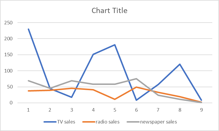
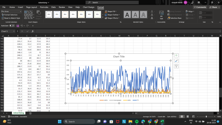
The line chart in Excel can efficiently plot one or more data series and is particularly good for showing patterns. It is not required to use markers, such as circles, squares, triangles, or other shapes, to identify the data points.
All category data is equally distributed along the horizontal axis of a line chart, and all value data is equally distributed along the vertical axis. For displaying trends in data at regular intervals, such as months, quarters, or fiscal years, line charts are the best choice since they can display continuous data through time on an axis with an equal scale.
Pie
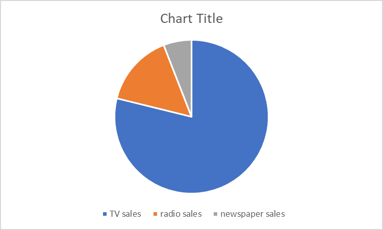
A circle-shaped chart with only one series of data can be called a pie chart in Excel. There are other pie chart variations, including doughnut charts and 3-D charts. Pie charts display a data series’ items’ sizes concerning their combined sizes. A pie chart displays the data points as a percentage of the entire pie.
Read More: Data Visualization Techniques in Excel
Area
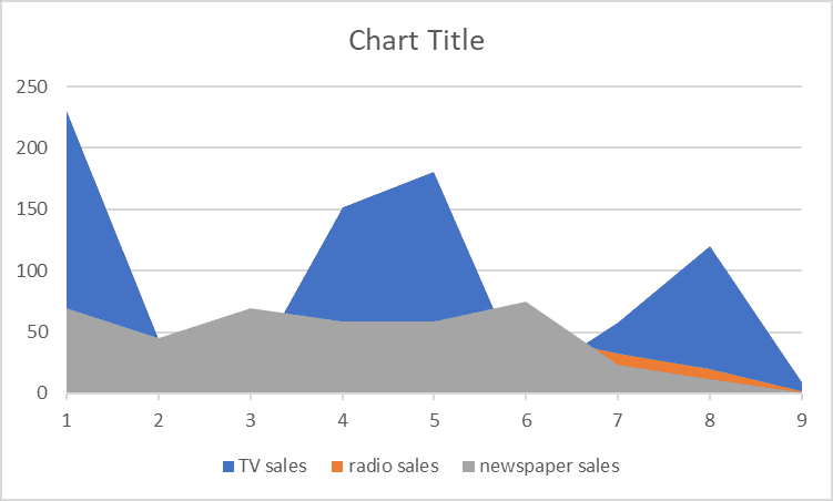
Area charts resemble line charts. However, the area below the line in an area chart is filled in. An area chart’s goal is to emphasize the size of these changing values over time, whereas the line chart’s focus is still on changing values over time.
Area charts can be used to illustrate change over time and highlight the sum of a trend’s values. An area chart also depicts the relationship between the plotted values and the total value by displaying the sum of the data.
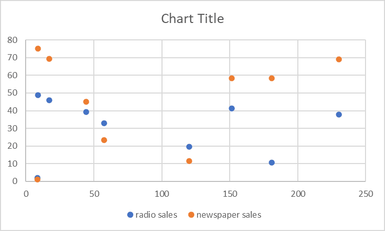
Scatter
The scatter chart in Excel looks at how two variables relate to one another. The XY Chart is a scatter chart in which the data points represent the intersection of two values on the X and Y axes. Scientific, statistical, and technical data are frequently represented and compared using scatter plots.
A scatter plot’s primary use is to display the strength of the correlation, or relationship, between the two variables. The correlation is larger when the data points fall more closely along a straight line.
How to Create Charts and Graphs in MS Excel
1. Choosing the Correct Chart Type
The first step in creating an excellent chart is selecting the appropriate type for your data. Excel offers a variety of Excel charts, including columns, lines, pie, bars, scatter, and more. Consider the type of data you have, the relationships between variables, and the message you want to convey when choosing a chart type.
2. Data Organisation and Preparation
It is essential to properly arrange and prepare your data before making an Excel graph. Make sure your data is organized in a table with different headers and pertinent categories. Eliminate any extraneous information or outliers that can bias your chart. Additionally, to concentrate on particular subgroups, sort and filter your data as necessary.
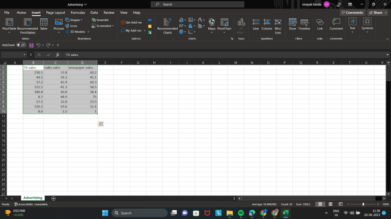
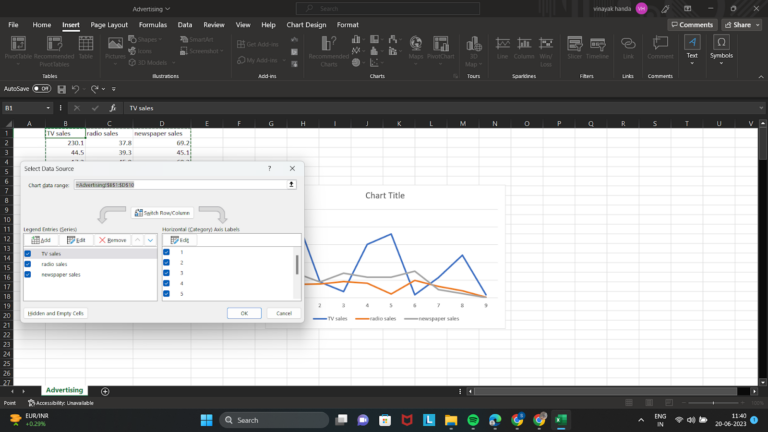
3. Highlight Data and ‘Insert’ the Appropriate Chart
There may be times when your data is not contiguous when you choose cells to be the source data. Remember that Excel displays all of the highlighted information on your chart. Holding down the Control key between options will allow you to only select what you require.
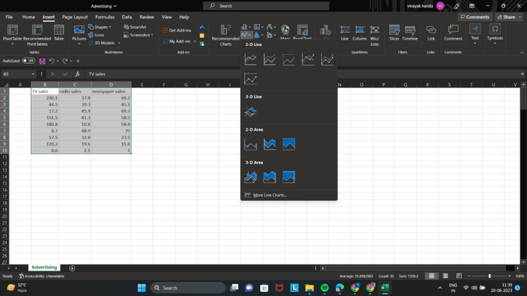
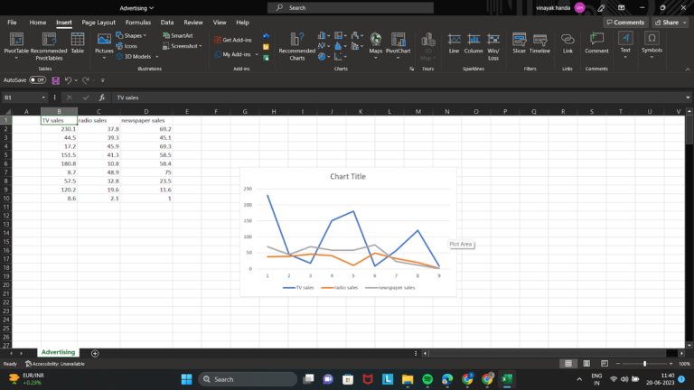
Then, select the desired chart type from the “Charts” section of the “Insert” tab on the Excel ribbon. Excel will create a graph using the data you’ve chosen.
4. Changing Chart Element Styles
It is crucial to customize numerous chart components to produce a visually appealing chart. In Excel, you can customize a wide range of elements, including titles, axis labels, legends, data labels, colors, and styles. Any chart element can be formatted by double-clicking it, or you can right-click and select “Format” to change a specific property.
Also Read: Advanced Excel Tips and Tricks for Productivity and Efficiency
5. Gridlines and Formatting Axes
Axes and gridlines are essential for giving your chart context and readability. Based on your data, modify the axes’ scaling, labeling, and visual appearance on the horizontal (x) and vertical (y). If required, format gridlines to highlight important intervals or remove clutter.
6. Using Chart Layouts and Styles
Excel offers a selection of chart layouts and styles from which you can choose to alter the overall look of your chart. Try out various layouts and styles to see which one best suits your information and intended message. Choose solutions that retain coherence and clarity in the design.
Note: You can use the same steps to create a graph in Excel.
Conclusion
When choosing the chart or graph type among the different types of charts and graphs in Excel, it needs to be well thought out in terms of the type of data and personalization. You can create aesthetically appealing and highly instructive charts that clearly express your data-driven insights by following the instructions in this thorough guide. To attract your audience and make your facts more intelligible, ensure that your charts and graphs are brief, straightforward, and aesthetically appealing. You can become an expert at making powerful charts and graphs with some practice and experimentation.
Frequently Asked Questions (FAQs)
1. How do I choose the right chart type in Excel?
You should choose the chart type based on the kind of data you have and the message you want to communicate. For example, column charts are useful for comparing categories, line charts are ideal for showing trends over time, pie charts show proportions, area charts highlight magnitude over time, and scatter plots help analyze relationships between two variables.
2. Why is data preparation important before creating charts in Excel?
Proper data preparation makes charts more accurate and easier to understand. Before creating a chart, your data should be arranged clearly in a table with headers, relevant categories, and no unnecessary values or outliers that could distort the visual representation.
3. How can I make my Excel charts more effective and professional?
You can improve Excel charts by customizing titles, axis labels, legends, data labels, colors, and styles to match the message of your data. Formatting axes and gridlines properly also helps improve readability and prevents unnecessary visual clutter.
4. What is the difference between a line chart and an area chart in Excel?
A line chart is mainly used to show changes or trends over time, while an area chart also shows change over time but emphasizes the size or total magnitude of those values by filling the space below the line. This makes area charts useful when you want to highlight volume as well as trend.
5. When should I use a scatter plot in Excel?
A scatter plot is best used when you want to examine the relationship between two variables. It helps show whether the variables are strongly or weakly correlated by displaying how closely the data points follow a straight-line pattern.